Tuesday 21 June 2011

Stickeroos


  I have always had a bit of a soft spot for Penny Black Stickeroos. I love the way they use the designs that appear elsewhere as stamps. Most of the ones I have bought are ones that match my Penny Black stamps. These are no exception (PB Corner Piece appears in the backgrounds) but I chose them because their colours looked so good next to a sheet of K&Co paper I just could not resist. The paper appears on the base of the easel card below and is from the Blue Awning collection. Although the flower images are printed I was pleased that I managed to use these alongside stamped backgrounds as I often have trouble combining printed papers and stamping.


This (above) is my favourite of the three cards. I've tried to pick out the colours from the Stickeroo to use in my inking. The Stamps are Hero Arts Old French Script, an Elusive Images Happy Birthday scroll (can't find its proper name) and a Craft Individuals crackle stamp. The centres of the flowers have been picked out with microbeads.


This is my least favourite piece. I wanted to use some more papers but the card was just too slim. But I was delighted with the results I got with my new Martha Stewart punch.


I'd never made an easel card before this one and wasn't sure if it would look right as a long narrow card. My favourite part is the stamped script in the panel behind the flowers. The blue paper is an Artylicious Echoes of Italy paper and looks like marble. The Happy Birthday stamp is from Elusive Images

Monday 20 June 2011

Getting rusty


You'd be forgiven for thinking that I've not done any crafting since Christmas. Because that's not too far from the truth. If you're a visitor to our Craft Stamping Quartet blog then you will see I haven't been totally idle. But I have made little other than the projects you see there. So I was a bit rusty when I needed to make a card for my dear friend Lesley's birthday. This card took a long time to hatch but in the end I was reasonably happy with it. The poppy pods, flourish and sentiment are all from Elusive Images (sadly no more but reborn as Chocolate Baroque). The printed paper is from the Motifica collection by Basic Grey. The filigree piece is by MIC. More on the way. Stay tuned.

Tuesday 28 December 2010

Christmas offerings

Here is a selection of the cards I sent this year.

 
Tri shutter santa card - Kanban topper and backgrounds


HOTP background paper, topper from Hobbycraft, Silver greeting and embossed panel created with the Cuttlebug.


Tri shutter bauble card. Made with a bought gift tag. Background papers by Craft Creations.

Toppers by Hobbycraft, embossed greetings and embossed panels by Cuttlebug, background papers by HOTP and Artylicious, Snowflake punch by Martha Stewart


New England cottage stamp and Silent Night text by Elusive images, snowflake embossing by Cuttlebug, Distress Inks in Broken China, corner punch by Anna Griffin, tiny gems by Glitterati

Background paper free download from GlendaWaterworth.com

Embossed background by Cuttlebug, poinsettia die cut by Marianne Createables, angel stamp by Elusive Images

Poinsettia die cuts by Marianne, punched fern leaves by L-Em

Holly flourish stamp by Stampendous


Noel stamp by Stamps Away

Cottage stamp by Elusive Images, background Sketchy Flourishes by Inkadinkado, colouring Distress Inks in Scattered Straw and Broken China


Colouring Distress Inks in Vintage Photo and various green markers for the trees


Gorjuss


I like the Gorjuss designs but don't really go for colouring stamps so have avoided buying the stamps. When I saw the Gorjuss designs in die cut packs I decided that was my chance to use the designs on some cards. I have also been looking for opportunities to use the fantastic  DCWV Mariposa papers. They are so scrummy that I couldn't see how I could make a card to live up to them. This is my attempt to combine the two. I hope it works. The Gorjuss girl is a tag die cut which I have slotted into the design on the paper, curling the flower to fit over the tag. The fibres on the left hold a tiny gold key.  The 21 is stamped onto an oval cut with a Nestie. The photo below shows the card closed with the Papermania embellishment on the back edge. The strong sunshine sadly is casting very long shadows which look a bit weird on the card.

While I wasn't looking


This is one of those cards that made itself while I was in bed one night. I had a card all planned out for my friend Judith but I had also been playing with these Viva stencils. When I'd finished experimenting I left a green and purple version out on my workspace overnight. In the morning it had talked itself into becoming Judith's card. I wanted to redo it in creams and pinks though. I used Distress Inks (in Vintage Photo and Victorian Velvet I think) to sponge through the stencil. The same inks also make a frame around the flourish
The flowers were punched from basic Grey paper which had been inked and stamped with a text stamp. I then shaped them and applied gems and pearls to the centres.


The background of the card has been stamped and clear embossed with Inkadinkado's Sketchy Flourishes. The sentiment is by Hobby Art.

Monday 27 December 2010

Coming up trumps

I have been crafting - honest! I need to do a few catch up posts to get up to date. This one goes back to the end of November when I needed a birthday card for Peter. He is a fan of playing card tricks but also collects playing cards and finds them quite inspiring artistically. His final piece for his A level Graphics was a huge playing card. So choosing this project for him wasn't a huge stretch of the imagination. I made it at a time when I was wanting to experiment with stepper cards. I had also just acquired Sir Tim's gorgeous Baroque die and was desperate to use it. So this is what Peter opened on his birthday.


The cards and background paper are by Kanban. The corner punch is by Anna Griffin. The King is mounted on the red satin card Baroque die cut. The card is so luxurious and you can see it better in this photo.


I felt a bit of a cheat using die cuts but I was pleased with the result and felt I'd improved my skills by working with very tiny margins in measuring the layers for the different sections. 

Monday 1 November 2010

Spookylicious!


I loved the stamps in the Elusive Images Halloween collection this year and have been looking forward to having a play with them for some time. Today I got some play time and realised my time was running out to make something spooky in time for this year. I've been wanting to make something for Peter to display in his room at university. When I read Lynn Robinson Hunter's tag tutorial in this month's Graphicus Guild newsletter it all started to come together.

Lynn's tag is actually a Christmas one with a flower, chipboard flourishes and the new Tim Holtz Facets. But what I really wanted to try for myself was her lovely background. I love the way she had used Distress Inks over an embossed design then stamped over the top. Lynn also has a real talent for combining DI colours that I wouldn't think of putting together.

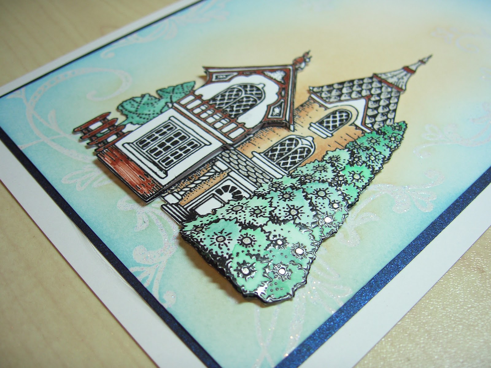
I followed Lynn's tutorial quite closely at first, using a giant tag as she had done. She stamped a flourish in Brilliance Moonlight White which I didn't have so I used Versamagic Cloud White instead and stamped a bat flourish from Inkadinkado's Halloween Trails. I embossed this with clear embossing powder then applied Antique Linen DI with Cut n Dry over the top. I was a bit discouraged to find my flourishes were barely visible. But I had also planned to use Dusty Concord and, as I had hoped, that picked out the bat flourishes really well. I also just caught the edges of the tag with Black Soot for a little extra definition.

The text is the Viva stamp Lynn used and is stamped in Versafine Vintage Sepia. The house (from Elusive Images' Spookylicious plate) was stamped three times on plain white card and lightly watercoloured using Dusty Concord and Antique Linen again. The roofs were clear embossed although that isn't really visible in the picture above. I curved the top two layers slightly to shape the house. The moon was coloured with a clear Stardust pen and is quite silvery in the light although it looks quite dull in the photo.


I had a few ideas for adding embellishments and  some wording but I was already quite pleased with the way the tag looked and the glue was still wet when Pete had to leave so I found a perfect deep purple satin ribbon and left it at that.

I really enjoyed making this tag and was glad I took a photo before it Peter took it away. I feel inclined to make some more spooky houses even though Halloween is over now. I am even thinking of ways I could use Lynn's design for backgrounds on my Christmas cards and, as luck would have it, Elusive images have made a Christmas cottage stamp in a similar style to this spooky house. And yes, you guessed it, I have that stamp already!